
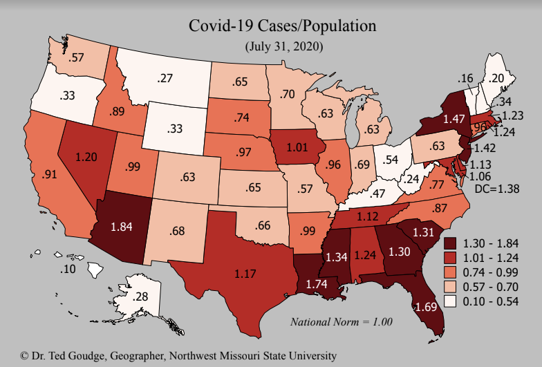
 “This week’s Covid-19 map, based on the Johns Hopkins (CSSE) data displays the number of cases in each state divided by the population (cases per capita). Previous maps have examined deaths per capita. The darkest shaded states on this map account for almost 40% of the cases nationwide. The states in the South and West have been making headlines with ever increasing cases and deaths. However, midwestern states are on the increase in cases, of late, as the virus continues its march throughout the nation. 30 States are reporting a rise in confirmed cases over the past week.”


Facebook Comments